 BBA Design:
Foundations
Advanced Projects
BBA Design:
Foundations
Advanced Projects
UNIT 1 - Visual Language
What is Visual Language and Literacy?
Video with George Lucas


How do we see, understand and interpret the world we live in?
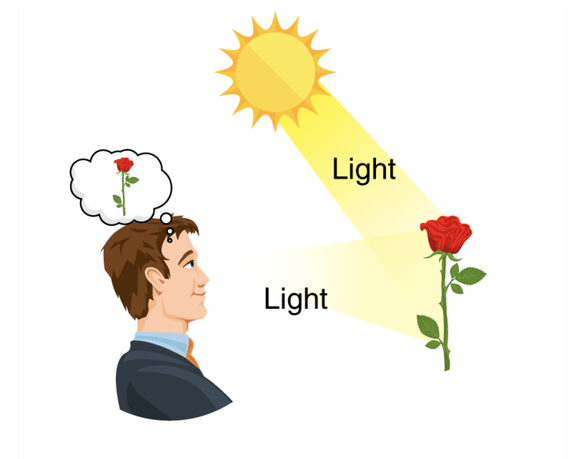
Our Eyes take in visual information in the form of light and turn it into electrical signals.
These impulses are transmitted through the optic nerve to the brain.
The brain then organizes this data into understandable chunks of information, which is then interpreted and given meaning. We use language to communicate and share that meaning.
We "see" with our brains.
Visual language, like other communication systems, is used to create and communicate meaning. We use images to communicate to others, our way of seeing the world, our belief systems, ideas about truth and beauty, feelings and emotions, our fears, hopes and dreams. In short, how we make sense of it all.
How effectively we communicate depends on how well you understand and use the basic elements and principles of the visual language, in effect, its grammar. Visual Language, like other language systems has its own set of rules, although they are more like guidelines. Becoming proficient in the use of visual language will increase your ability to communicate meaning and creatively solve problems. Consider, for instance, the word imagination. The root of the word is image.
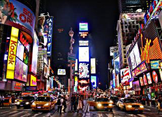
Visual languages have developed over thousands of years and across many different cultures. We see and interpret images based on our own cultural framework and personal experiences, yet there also is a kind of universality to them - because, after all we are all humans. At a certain level, visual language can be understood by many different people from many different places and from long ago up to the present day.
A little Theory: Form, Content, Subject
The Image: Culturally Specific or Universal?
Before moving on we need to Consider the different cultural frameworks for making and looking at art
The information in this unit is based on a specific cultural framework - that of Western European culture. It is not the only way to look at and understand the visual world, indeed other cultures and even Western European Culture, in other times looked at things quite differently. It is always important to keep this in mind when looking at or creating art and design.
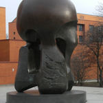
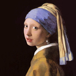
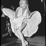
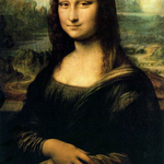
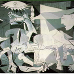
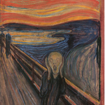
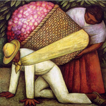
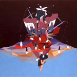
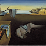
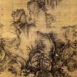
ACTIVITY 1 - Compare and Contrast
Compare and contrast these two paintings. Use the link below to view the images.
Observe the two images and consider how they similar and how they are different. Answer the following questions as specifically as you can.
What am I looking at?
Describe the two images to the best of your ability. Describe what is before you in as much detail as possible: Shapes, colors, textures, and space.
How was it made?
What media, materials, and techniques were used?
When and where was it made? What kind of person made it?
When and where do you think these images were made, and what makes you think so? What was the world like in the time in which the artist made the work and how might that have influenced the kind of work they made?
What is the work saying?
What meaning or message do you think the artist was trying to convey?
Briefly describe your own feelings or thoughts about these two images. Do you prefer one over the other - if so why?
PROCEDURE
If you have not already done so create a new page title it: Unit 1 - Visual Language
Take a screen shot of the image(from the presentation)
Go to your UNIT 1 page
Make a text box and type ACTIVITY -1 COMPARE AND CONTRAST
Underneath the heading insert your screenshot of the image.
Underneath the image create a new text box and write your answers to the questions above.
PUBLISH YOUR WORK
Press the Publish button on the top right of the page
SUBMIT YOUR WORK
COPY the url from that page
OPEN onCampus and go to the assignment page for this class.
PASTE the url into the text box. DO NOT USE THE ATTACH FILES FEATURE
PRESS SUBMIT.
After you have submitted your assignment we will discuss this in class.
MORE THOUGHTS ABOUT CULTURAL DIFFERENCE IN THE VISUAL ARTS
Presentation of similarities, differences and mutual influences
Activity 2 - How Pictures Work - overview
HPW - CLASS or HOMEWORK: (graded as an activity)
Read the first section of this book up until the page that says "Principles"(its mostly pictures!)
After you have completed the reading, in your e-portfolio answer the following questions:
What are the most important characteristics of the main characters and how does the author represent them visually?
What is the crucial moment that is depicted? Why did the author pick that moment, and how does the author "illustrate" this moment?
Why does the author use only simple shapes and limited colors to illustrate this story?
PROJECT - How Pictures Work
By way of introduction we will explore some basic principles of how pictures (a specific kind of visual product) work. In this project you will be introduced to many of the main concepts that will explore in more detail over the duration of the course.
Objectives of this Project:
- To create an illustration of a descriptive paragraph, that conveys the sense, mood, or feeling of that paragraph (or event) using only cut paper and simple shapes,
- Understand the basic principles of visual language in order to accomplish this.
- To use the iterative process and purposeful play to arrive at the best solution of this visual problem.
- To reflect on your process and able to describe your choices and why you made them, referencing the principles of visual language.
- To follow the specific directions of the assignment, to organize and accurately post your work in your e-portfolio, and correctly submit the assignment for grading.
THE PROJECT
The design challenge: You have each received a paragraph from an important literary work. You have been asked by the author to submit an illustration of the paragraph to be used as the artwork for the cover - of a new edition of their work. The author would like you to capture and communicate the mood, feeling or action of the paragraph. they would like you to do this by using only simple abstract shapes and limited color. They do not want any representational drawing or imagery.
- You will work individually
- You will also work with others in the class as you employ the method of iteration and critique to create the best possible solution to the challenge.
Constraints
· Select only 3 colors of paper AND white (you must pick white). One
of these will be 9x12" and be your background color, the rest are smaller 6x9" pieces.
· Use only simple basic shapes (circles, rectangles, triangles) and
their variations. You may also make freeform shapes, but do not make realistic depictions of either the characters or setting of your paragraph.
· No drawing allowed! You can only cut out the shapes. You can
make more complex shapes out of the simpler ones. Simpler is better!
Here is an exemplary student project
Take a look at it to see what's possible! This project was done with a slightly different emphasis and prompt but the basic objective is the same.
Part 1
· Read the paragraph you have been given, or been assigned, carefully.
Thinking about color, shape, and framing write down some notes - how might you best illustrate this paragraph?
· Select the colors that you feel most appropriate.
· Begin to cut out some shapes that might work – try different things!
· Play with them trying out different arrangements
· When you think you have a good solution – photograph your work
but do not glue it down.
· Put all of your pieces and unused paper in an envelope.
Some Advice:
- Think but do not OVERthink this.
- Do not plan too much. Instead explore the possibilities by making - just start making!
- Less is more! Remember to use simple and fewer shapes, but make them count!
Here are some guiding questions to think about as you do this work.
- What is the essence of the person, place, or thing that you want to represent?
- What is the overall mood or feeling of the situation that you want to represent?
- What specific elements in the situation evoke strong feelings in me?
- How can I accentuate or emphasize these?
- What feelings do I want to evoke in the viewer?
Here is the document with the descriptive paragraphs.
You will be assigned a specific paragraph for this project.
Day 2 - Class Presentation and discussion
In the second half of the book, the author, discusses in detail the basic principles which she feels are essential to good picture making. View the presentation on the principles and discuss as a class.
Critique and revision (iteration)
Pair up with someone who was not in your original group and using the photograph you took at the end of the first session critique each other’s work using the following format.
The person giving the critique:
In one or two sentences say…
I like this (this works) BECAUSE (give specific reasons – remember that presentation of principles).
I wonder if…. (make specific constructive suggestions- again referencing the principles wherever possible)
The person receiving the critique:
Writes down the comments of their partner, but does not respond verbally.
Switch roles and repeat
Return to your paper pieces from part 1 and after contemplating the suggestions of your partner and either adopting or rejecting them, re-make your work. It can and should change, either because of the critique comments or some new knowledge gained from the information in the presentations. You may select up to TWO new colors, and additional elements if appropriate.
Complete your work and this time glue it down and photograph.
Post all of your images to your portfolio. This includes your preliminary work as well as the final. Please label everything appropriately.
Reflection Prompt:
Write a short reflection, using your own notes and the guiding questions listed above.
- Briefly describe what was the feeling ,mood or idea you were trying to convey.
- What shapes and colors did you use and why?
- How did your work change or evolve as a result of your iterative process and critique?
Post this reflection underneath your images. Make sure you cut and paste the text of the paragraph you chose underneath your illustration.
PROJECT -Part 2 - HOW PICTURES WORK 3D
Using your work in the previous project as a basis, create a three dimensional version. Use the same 3 colors + white of construction paper or you can substitute ONE new color. and a cardboard base that is 8x8"
After you have completed your work photograph it FROM AT LEAST 3 DIFFERENT ANGLES and post it to your e-portfolio.
Write a short reflection using the prompts below and post it underneath your image.
- The process of "translating" your composition from 2d to 3d can be a challenge - how successful were you?
- How did your composition change as a result of the shift from 2d to 3d?
- What limitations or possibilities did the material (paper) present?
Publish, copy the link and submit in OnCampus.
Alternate Version
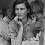
Do visual research about a recent current event which has affected you in a significant way. It is important that the event you choose has significant emotional and visual importance.
Process:
Step 1
Collect between 6-8 images of a recent current event that made an impact on you.
Upload these to your e-portfolio.
Select one image to work with and answer the following questions.
- Whats going on in this image?
- What do you see that makes you say that?
- What message or meaning do you think the photographer was trying to convey?
- Why did you select this particular image over the others from your initial research?
Post your all of your visual research and your answers on your website.
Step 2
Create a visual response to the event by following the specific criteria, process and materials detailed below. Your response can be emotional, analytical or something else. Use only basic abstract shapes*. Do not try to create realistic or literal representations of the elements of the event, or to copy the image from the previous activity. There is NO drawing allowed!
* The basic shapes can be ellipses, rectangles, polygons in their many variations) They can also be geometric (derived mathematically), or organic (derived from nature).
PROCESS
- Select 4 colors of construction paper.
- From the colors you have chosen, select a background color (based on what seems most appropriate. Your background SIZE should be 9x12"
- Out of the other colors, create by cutting, some SIMPLE BASIC SHAPES that you can play with, and arrange them on the background color.
- Continue to arrange and add or subtract shapes until you think you have made a satisfactory solution photograph it, but Do not glue this down. Repeat this process 2 more times, for a total of 3 iterations (or versions) of your work.
- Engage in a Critique, with a classmate or me. Use the feedback to choose the best, solutions and how to further refine and improve it. Record the information from your critique in your sketch/journal.
- Make the final choice for your composition and neatly glue them into place.
- Upload your 3 prototype designs to your website. Use the heading Project- How Pictures Work- Option 2
- Scan or photograph your final work and post it to your e-portfolio.
- Underneath the images post he paragraph you have chosen.
- Write a short reflection (see below) and post underneath your image
- Publish and copy to the URL link and paste it into the assignment text box in onCampus.
REFLECTION:
- What was the essence of the person, place, or event that you wanted to represent?
- What specific elements in the situation evoked strong feelings in me?
- How did I accentuate or emphasize these?
- What feelings did I want to evoke in the viewer? How did I choose and arrange the basic shapes and colors to achieve this?
- How did your work change or evolve in your 3 iterations (versions)?
PROJECT 3 FORM, CONTENT, SUBJECT
Objectives:
- To be able to define and understand the relationship between Form, Content and Subject and how they work together to create meaning.
- To explore how to look at art and design and be able to develop an informed and individual response to it
- To understand and execute the workflow of the class.
Procedure/Criteria
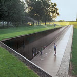
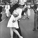
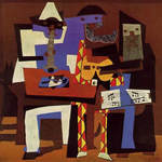
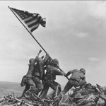
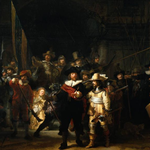
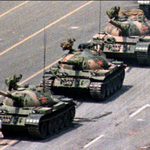
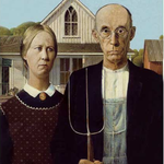
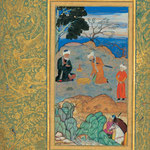
Pick ONE image from the Gallery below. Or, alternatively, select an ICONIC image from another source. An ICONIC image is one that has a certain amount of widespread acceptance as an important image, made by a recognized individual in the field, that carries significant cultural meaning.
Using the example below, write a brief statement describe how the image uses form, content and subject to create a total work. Place it underneath the image.You will want to include:
- THE FORM (HOW) - What do you see? How are color, line, shape are used to convey a meaning or message? What media, materials, techniques and format was used?
- THE CONTENT (WHY)- What is the meaning or message of the work?
- THE SUBJECT (WHAT) - What is the subject and how does this work with the two other categories ?
- THE CONTEXT (WHO made it -WHEN it was made?) The larger historical/socio-economic environment in which the work was made.


EXAMPLE: Below is an example of how to arrange your image and writing. Post it under the appropriate heading in your e-portfolio.
Project - Form, Content, Subject
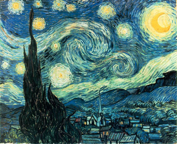
WHO(Context):This is the painting Starry Night painted by the Dutch painter, Vincent Van Gogh. Van Gogh was a Post Impressionist painter and lived from 1853- 90. Although from an early age he expressed the desire to paint and draw, and eventually devoted his life to this pursuit, he never had any formal artistic training. He was a prolific artist and his paintings eventually evolved into a highly expressionistic and colorful style with a heavily textured surfaces (impasto). Van Gogh suffered from debilitating mental illness for his whole life and took his own life in 1890.
WHEN(Context): 1889 In the broader societal view this was a time of great transition from a agrarian society to a highly industrialized one. A rising middle class provided both the subject matter and the audience for many painters such as the Impressionists, who documented this new society. New artistic, scientific and technological discoveries including the camera, were changing the way that people saw and understood their world. Van Gogh, was reacting to these changes in his own unique way, and is considered to be a POST- impressionist painter.
The Subject(What):
The town (probably Saint -Remy-de-Provance) and the night sky above it. It was painted from his room in the asylum where he lived.
The Form (How):
The artist has used swirling lines and shapes to give a sense of movement and energy in the sky. By contrast, the town below the sky looks peaceful. The colors the artist used all seem to be blues and greens with some yellowish points of light. This makes the painting seem kind of cool like it gets at night and also a little unsettling. He used very thick paint which makes it feel almost like its a real living, moving thing.
The Content (Why) (meaning or message):
I think the artist is trying to say that the world and maybe the universe is filled with an amazing kind of life force and energy, and this goes on all around us all the time, whether or not we are aware of it, even when we a sleeping peacefully. The painting shows the CONTRAST between these two modes of existence It makes me think of how big the universe is and how small we are. Van Gogh was living in a asylum (hospital)when he painted this. maybe he was feeling very overwhelmed with these intense feelings and it made it difficult to live his life peacefully.