BBA Design:
Foundations
Advanced Projects
BBA Design:
Foundations
Advanced Projects
Unit 6 - Value/ Grayscale / Found image collage
Unit Objectives:
To explore unity, visual contrast and visual hierarchy, through the manipulation of shape (circle, rectangle, triangle), value (light & dark), visual texture, figure/ground relations.
To use both digital and analog tools and techniques to explore the collage form. Including: scanning, cropping. layers, organization of workflow, Sourcing of
imagery from found images in books and magazines.
To use the iterative design process to create visually compelling abstract collage compositions.
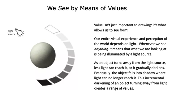
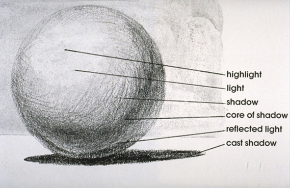
Value -The lightness or darkness of tones or colors. White is the highest value and black is lowest value.
We often think of a scale of Gray values. This type of value scale is called achromatic (a lack of color). Colors also have a value, both as hues in and of themselves (for example yellow has a higher value than blue), and as tints and shades of hues.
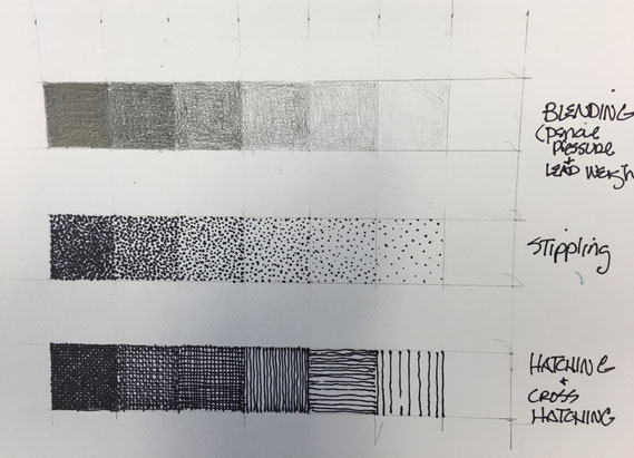
ACTIVITY 1 - GRAY VALUE SCALE
In this activity you will create a seven step gray value scale using different media and techniques.
1. Create a series of seven 1" squares in your sketchbook do this 3 separate times (see example).
2 The first scale should be done with a #2 pencil, the second scale should be using ink (sharpie) and the technique of stippling, and the third scale should be ink using line.
3. Photograph or scan your work, post to your portfolio and submit in onCampus.
COLLAGE AND THE MODERN WORLD
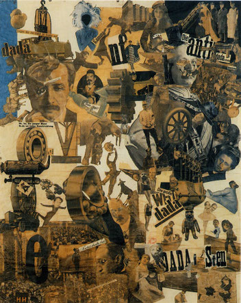
Collage is a visual art/design technique with roots going as far back as the first printed materials, but most commonly associated with "modern"artists such as Pablo Picasso and Georges Braque at the beginning of the 20th century.
For these and other artists the wealth of visual materials, the result of modern printing and photographic process as well as a growing consumer society was incorporated into older forms of art/design such as painting and drawing. For other artists such as Hannah Hoch (who's work is shown above), these "found" images became a radical and revolutionary form all its own.
Collage Presentation
ALTERNATIVE PROJECT - FALL 2020
The following is an adaptation of the typical way I offer this project. This is due to the particular circumstances of this semester. Much of the information, expectations, objectives are the same, however this variation of the project is a condensed version of the normal project. DO THIS VERSION - READ ON!
Grayscale Collage compositions (alternate version)

Digital Collage (Photoshop)
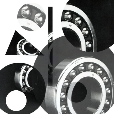
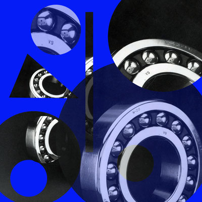
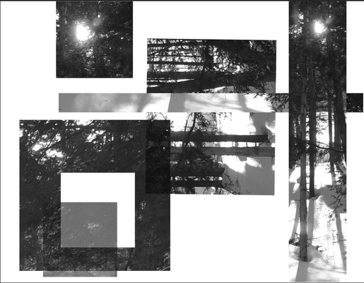
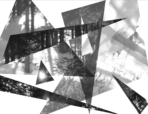
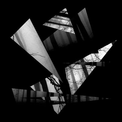
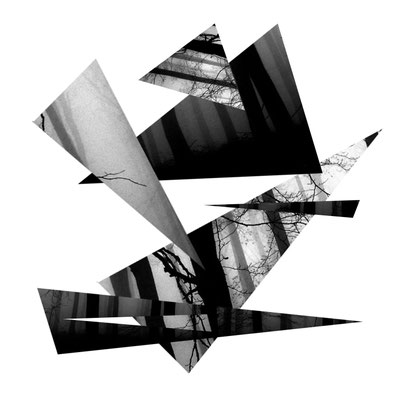
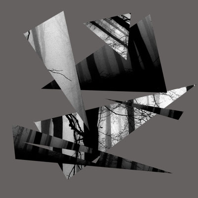
Create 3 grayscale compositions from a single source image that explore visual harmony, negative and positive space and the gray scale (dark and light values)
Composition #1 - uses only rectangular shapes.
Composition #2 - uses only triangular shapes.
Composition #3- uses only circular shapes
OBJECTIVES:
To use the balance positive and negative shapes to express both unity and contrast.
To use interesting contrasts of light and dark and different textures to add visual interest.
To create a sense of space or depth by overlapping, transparency, and scale.
To explore rhythm and movement with the selection and placing of the shapes.
CRITERIA:
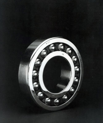
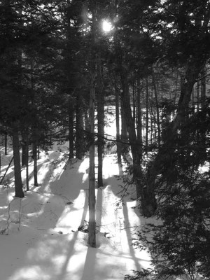
Use a single high quality, black and white image as your source image. You may find one on the web (be aware of copyright issues). What makes a high quality image for this project?
- A high quality images should have a wide range of interesting values and shapes. Some high contrast (very black to white), some low.
- Should be a large sized file (see "tools" in google image search)
- Should be creative commons license
- Subjects such as buildings, machines, trees work well.
PROCESS:
Create a separate file for each composition. The format is 8"x8" square.
Use the appropriate selection tools (ellipse, rectangle and polygon lasso tool) to complete the composition. Instruction will be provided on this process.
Create a few shapes to begin with and start moving them around.
Think about the spaces between the images as well as the images themselves.
You can overlap images.
See how the same basic image can produce vastly different new compositions
due the shape of the selections.
After you have completed the compositions save as a jpg, or screen shot (png) and post ALL of your images including your source image to your e portfolio, submit in on Campus in the usual way.
REFLECTION:
Please write a short reflection on this project. Consider the objectives, process and criteria above - how well did you meet them? Try to use the vocabulary and concepts that are referenced above For example: Pay close attention to the concept of negative and positive space and how these look differently in the 3 compositions. For your final compositions, explain your choices. Post to your portfolio and submit the entire project.
In making your compositions consider the following principles:
Figure/ground or negative/positive space relations
Contrast of shape
Contrast of size
Contrast of orientation
Contrast of texture
Contrast of light and dark
Visual hierarchy
Degree of transparency
Visual space (depth)
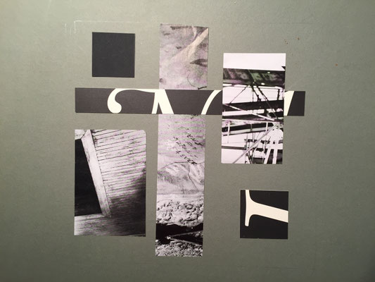
PROJECT 1 - Grayscale Collage Compositions.
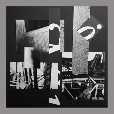
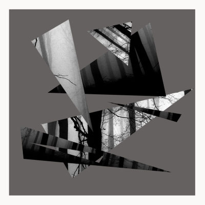
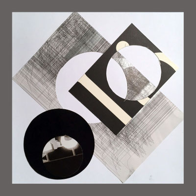
Create 4 grayscale compositions using "found" materials that explore visual harmony and the gray scale (dark and light values)
Composition #1 - uses only rectangular shapes.
Composition #2 - uses only triangular shapes.
Composition #3- uses only circular shapes
Composition #4 - uses all three shapes (DIGITAL VERSION)
Objectives
To use positive and negative shapes to express both unity and contrast.
To use interesting contrasts of light and dark and different textures to add visual interest.
To create a sense of space or depth by overlapping and using scale
To explore rhythm and movement with the selection and placing of the shapes.
Criteria
Your source material
Your images from this project must be in black and white*.
* this means various gradations of gray (a tonal range form pure black to pure white. However due to various circumstances, grays will often contain very slight hints of color, providing rich variations and warm and cool tones.
Your compositions must be created in 10x10" square format.
Images can be found in old magazines and books. There is a section of the bookcase in the design studio where these live. You should also seek out other places such as home, doctors offices, the library etc. Please make sure that it is ok to use the materials for collage which means cutting them up.
If you find a book or magazine that is particularly good material but you can't cut it up, you can scan the images into your computer. (I will advise)
Get more than you think you need. Look for high quality images that have interesting ranges of dark to light, strong visual textures and interesting shapes within the image itself.
Cut out full pages if you think there might be multiple parts of if you can use.
Cut out the basic shapes: circles, rectangles and triangles
Cut out lots of each. Make them different sizes and proportions. Look for the most interesting parts of the image and make a shape out if it.
Make only circles, squares and triangles.
Avoid recognizable images.
Look for variations of visual and real texture
Look for variations of dark to light
Put your shapes, organized by type into manila folders or envelopes
When you are creating digitally, the process is slightly different.
In this case you will create your shapes in photoshop.
In making your compositions consider the following principles:
Figure/ground or negative/positive space relations
Contrast of shape
Contrast of size
Contrast of orientation
Contrast of texture
Contrast of light and dark
Visual hierarchy
Visual space (depth)
Play, iterate, and explore the possibilities
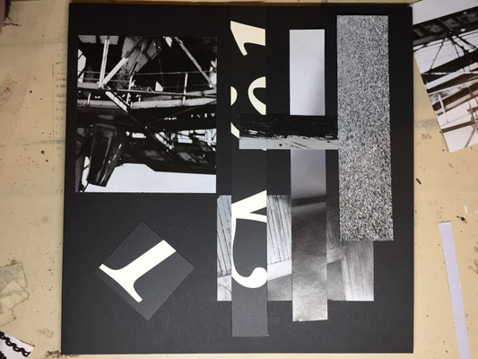
Composition of rectangular elements in progress
Process:
Select a few shapes to begin with and start moving them around.
Think about the spaces between the images as well as the images themselves.
You can overlap images.
You may want to add images, or change them out as your go, but remember economy of means (less is often more).
Experiment with different backgrounds (black, white, gray, other neutral colors - you can even combine them. your backgrounds should be 10"squares.
When you find something you think is good, photograph it. Continue to explore the relationships between the shapes. Document your process at 3 different points in the process.
Get feedback from someone about your compositions. Consider it carefully and then refine your work. You do not have to accept the feedback if you feel it is not helpful or not what you are going for, but you should consider it.
When you have refined your work glue it down to the 10"x10" background.
I will provide a demonstration for the digital composition.
Make sure to submit your work through onCampus. I will begin deducting points if this is not done correctly. If you have questions ask me or someone who know how to do it.
Digital Version - Working in Photoshop
I will give a short lecture/demonstration that will instruct you on some of the many ways that you can create interesting collages digitally. We will cover making selections and the selection tools, and go over some basic info on using layers.
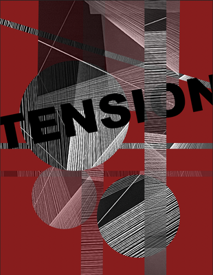
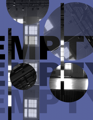
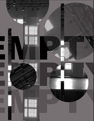
For this portion of the project you will create your final collage in grayscale from a single image. You will find these images on line or you can use your own
Make 3 different versions using the same to original images. post to your portfolio. the best and easiest way to do this is to make your first image, then save it. Then once saved begin working on your second version. When you feel that you have finished it, then SAVE AS and give it a different name - or number. Repeat this process for the third version.
Next, select the one you believe is the most successful. Save that version with each of the following fill layer colors: White, Black and a medium value grey. Post these to your portfolio as well.
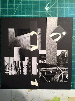
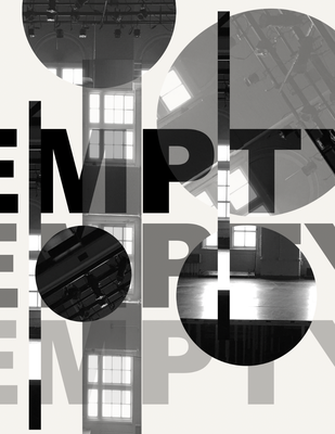
Add text. Look at the work you have created. Select a single word that seems to represent the feeling or mood of the image. Using the text tool type that word into the image file. Select a type face that seems to also emphasize the mood or feeling. Experiment with the size and placement of the word. Think of it as another design element. See the examples below
Reflection:
Please write a short reflection on this project. Consider the objectives, process and criteria above - how well did you meet them? Try to use the vocabulary and concepts that are referenced above For example: Pay close attention to the concept of negative and positive space and how these look differently in the 3 compositions. For your final compositions, explain your choices. What could you do to improve this project, where you to do it again? Post to your portfolio and submit the entire project (both digital and analog versions).
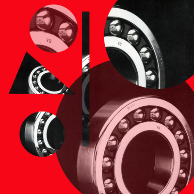
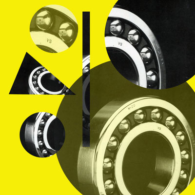
Extension: Value and color -
Take your final digital version and create copies each with a different colored background, using the 3 primary colors.
Using the layer transparency feature to achieve different combinations of complimentary colors, .take your final digital design and create 3 versions/variations using a pair of complimentary colors as backgrounds.