UNIT 8 - TYPOGRAPHY
Typography is the art and craft of working with the visual aspect of words.
Letters and words can be thought of as symbols, in that they stand in for something else. That something is the meaning with which a given society agrees to. Typography has both a practical function and an aesthetic one, both a denotative and connotative meaning. The letterforms themselves are also design elements in their own right, in that they are compositions or arrangements of discreet elements that make up its form.
In this unit we will explore some of the basic terminology, uses and meanings of typography as a design element.
Some basic terminology:

Definitions:
Typefaces
Refer to the specific design of an alphabet. these are the names that we are used to seeing such as: Future, Times, Helvetica etc.
Typestyles
Are the many different variations of the typefaces that can be used such as:
Roman, Italic, Regular, Bold , Condensed etc.
Fonts
A font was traditionally used to designate the size of one specific typeface in a particular typestyle. However today font is usually used more widely as a stand- in for both typefaces and type styles.
Points
Are the unit of measurement for typography. A wide array of point sizes are easily accessed on your computer.
TYPEFACES

TYPESTYLES

Activity 1 - Watch the video and take notes! Take a photo of your notes and submit in onCampus.
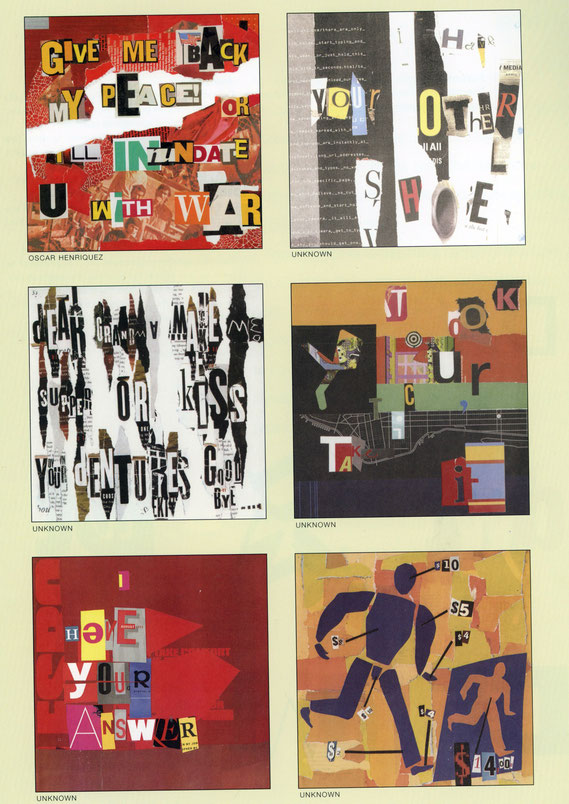
activity 2 : Ransom or Love note - Collage with found letterforms


Ransom note examples:

Criteria and Process
In this activity you will explore the expressive quality of letterforms and how they can be chosen to send a certain "message", as it were. The intentional arranging of the different letters which make up the message as well as any other visual elements you choose to include should work together. Think carefully as you choose your letters and other images, as well as what colors shapes and textures.
To be done in your sketchbook on a single page
Compose a short love note or a ransom note that is humorous in its tone. Please make sure that what you write is appropriate for school.
Use found letters cut from magazines and newspapers, as well as any other found imagery and media you have access to (marker, colored pencil etc), to create a visual note (see examples below). The majority of the letters in the message should be different
The letters should be the main focus of the work, but the other elements can enhance the overall effect and meaning of the work.
Photograph, post, and submit your work as usual.
Project - Typography as a Design Element
In this project you will explore typography as a design element in its own right. Although we use letters all the time, we rarely think of them as designed objects, but that is exactly what they are. Each and very typeface has been thoughtfully designed.
Part 1
In the first part of this project you will explore the compositional potential of letterforms - first as a single letter and then in combination with a second letter.
Process:
- Create a new document in Illustrator, select the size as 2.5x2.5" and the number of art boards as 9
- Select a typeface that appeals to you or might symbolize some aspect of your personality. Are you BOLD, funny, sensitive etc. ?
- Using only that single typeface in each of the 9 art boards play with the size, orientation and location of that letter to explore different compositional possibilities. Pay close attention to the negative and positive spaces as you explore. Push the shape of the letter as far as you can, even to the point of obscuring the total letter itself.
- When you have completed all 9 take a screen shot and post to your portfolio
It should look something like this:

Part 2
In the second part of this project you will follow the same basic procedure as in part 1, but this time you will add the second initial in a CONTRASTING
typeface. That is is your a serif letter in the first part, the pick a san-serif in the second. Using BOTH of the letters explore the compositional possibilities and the relationship between them. It could look something like this. (this is a partial view, your file should have 9 squares as in part 1).

Project 2 - Typography as a design Element with color
I admit I'm just having a little too much fun here!
Criteria:
- Create 4 8" square files in Photoshop OR a single file with 4 8" square art boards in Illustrator. You can do this project in either program, however I think it works better in Photoshop.
- For your compositions select two very different typefaces that reflect two very different aspects of your personality, and correspond to your initials.One must be a serif typeface and the other sans serif.
- Using principles of design and the contrast of line, color, shape, texture, value, depth, and balance, create three different compositions.
- In addition to the typefaces, include three colored fill layers using . These will be blended using the transparency tool to create interesting background colors.
Process:
- Select your typefaces
- Create your files (4) use a square format
- Use the various tools to create your compositions (instruction will be provided).
- Post to your website in Unit 8 - Typography
- Write reflection
- Submit in OnCampus
 BBA Design:
Foundations
Advanced Projects


